Best Moroccan Color Palettes for Home Interiors
Moroccan design is known for its rich interplay of colors drawn from landscape, culture, and craft. Whether you are decorating a living room, bedroom, kitchen, or outdoor space, choosing the right palette can transform a room from ordinary to inviting and expressive. Moroccan palettes blend warm earth tones, vibrant accents, and harmonious neutrals — creating spaces that feel grounded, dynamic, and full of character.
In this guide, we explore some of the most inspiring Moroccan color palettes and how to apply them in modern interiors.
Why Moroccan Color Palettes Work in Interiors
Moroccan color schemes are rooted in centuries of cultural exchange and environmental influence. They draw from desert dunes, medina doorways, spice markets, and the celebrated blue streets of cities like Chefchaouen. These color traditions are not only beautiful, but they also serve emotional and practical functions — bringing warmth, depth, and a sense of place into interiors.
The key principle is balance: pairing bold hues with grounding neutrals so that spaces feel expressive without becoming overpowering.
Earthy Foundation Palette
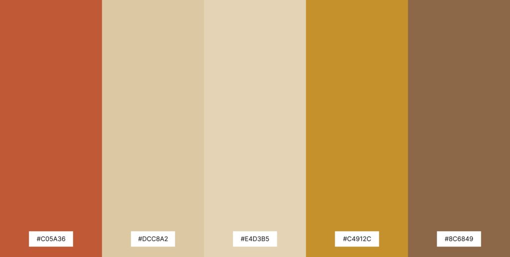
The backbone of many Moroccan interiors starts with earthy tones:
- Terracotta — evokes sun-baked clay and traditional walls
- Warm beige — softens and harmonizes brighter colors
- Sand and ochre — bring natural warmth and calm
These hues create a cozy foundation for floors, walls, or larger furnishings, making them ideal base colors when building a room palette.
How to use: Paint larger areas (walls or cabinetry) in warm beige or sand tones, and use terracotta as an accent wall or upholstery color for visual warmth.
Jewel Tone Accents
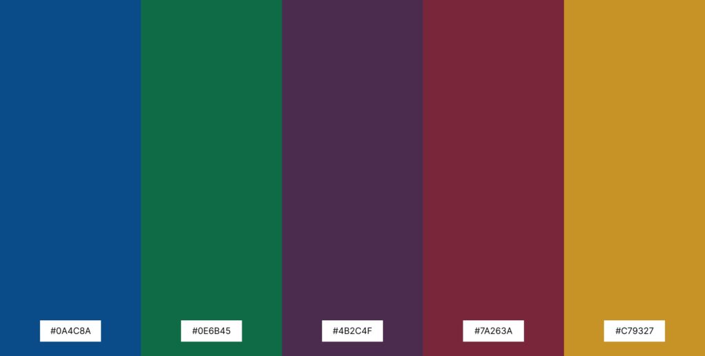
Moroccan palettes often include rich jewel tones that add vibrancy and visual interest:
- Cobalt blue — inspired by city walls and tilework
- Emerald green — references gardens and lush foliage
- Deep plum or burgundy — adds depth and contrast
These shades work especially well in accessories such as cushions, rugs, artwork, or pottery. A single jewel tone placed against a neutral backdrop will become a focal point without overwhelming the space.
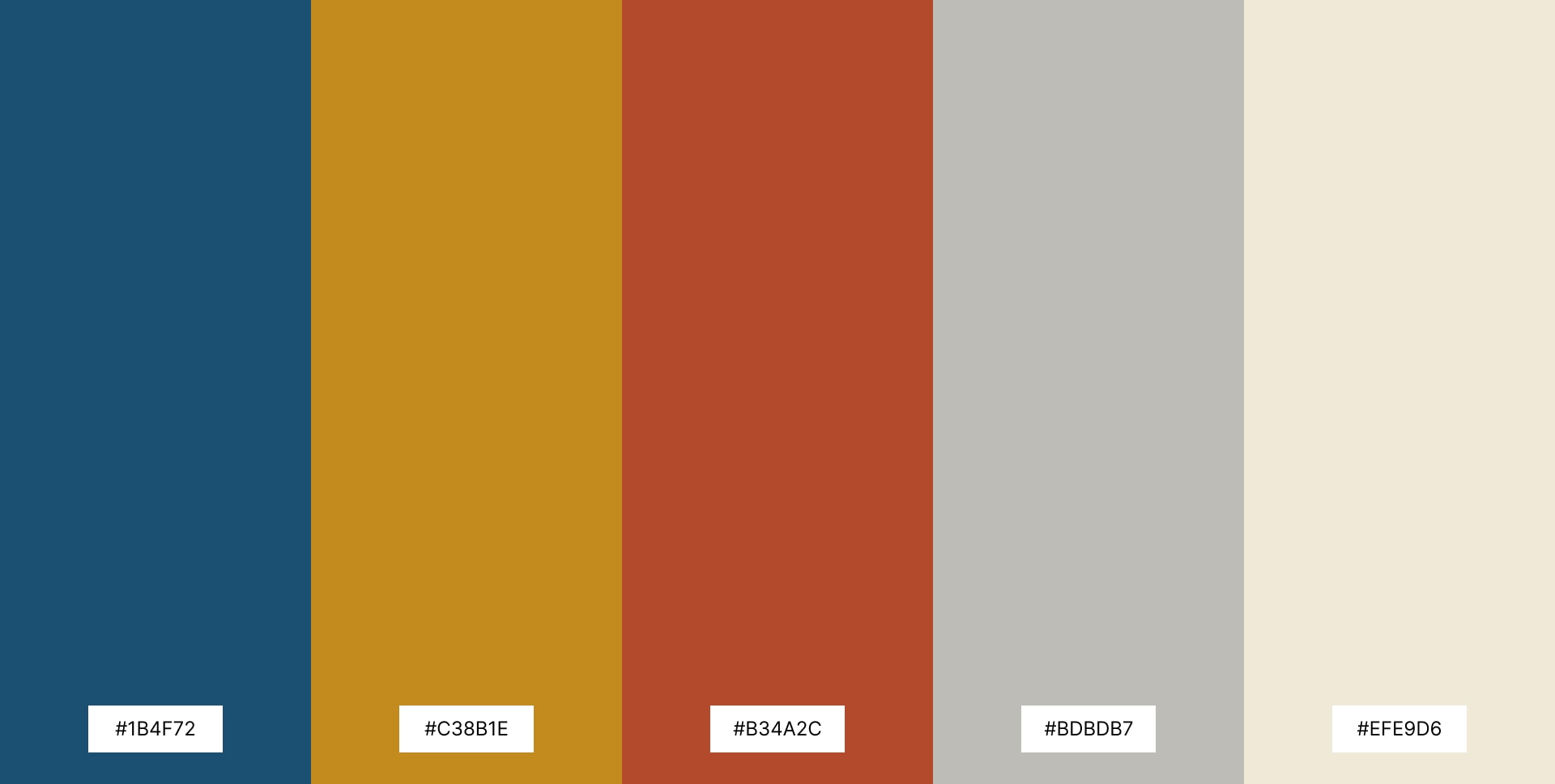
Contrasting Highlights
To create dynamic harmony in a room, consider pairings such as:
- Deep blue and warm ochre
- Burnt orange and soft grey
- Emerald green and cream
Complementary pairings — colors from opposite sides of the wheel — bring visual balance and vibrant contrast while maintaining cohesion.
Example: A living room with warm beige walls, cobalt blue cushions, and a rug featuring rust and cream tones feels both rooted and lively.
Subtle Neutral Schemes
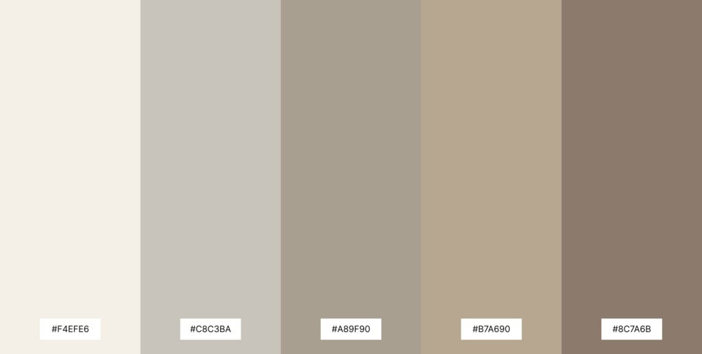
Not all Moroccan interiors rely on bold hues. A more subdued palette can bring elegance and timelessness:
- Cream or ivory
- Warm grey
- Mud or mushroom tones
These neutrals offer serenity and pair beautifully with texture — such as woven textiles, clay pottery, and carved wood — to bring richness without strong color contrast.
How to use: Use neutral walls and large furniture, then layer in texture with rugs, baskets, and soft furnishings for a tranquil yet tactile room.
Layering and Accent Elements
Color in Moroccan design rarely stands alone. It is enhanced through texture and pattern:
- Zellige tiles contribute variations of blues, greens, and warm earth tones
- Textiles and rugs combine multiple colors in repeating geometric patterns
- Brass lighting and accessories introduce warm metallic highlights
This layering creates visual depth and invites exploration in a room.
Practical Tips for Choosing Your Palette
- Start with a Base: Choose a neutral like warm beige or soft sand for walls or larger pieces.
- Add Bold Accents: Use one or two vibrant hues — for example, cobalt or emerald — in textiles and décor.
- Balance with Texture: Rugs, throws, and tiles will enhance color impact and add richness.
- Test in Light: Colors change with lighting; test paint swatches in different parts of the room before committing.
Conclusion
Moroccan color palettes offer endless possibilities for home interiors. Whether you embrace earthy foundation tones, rich jewel accents, or subtle neutrals, the key is harmony and intentional placement. Use these palettes to create spaces that feel warm, expressive, and deeply personal — rooted in tradition but adapted to contemporary living.